Because my final major project focuses on a very specific period in time and a specific setting I wanted to explore new ways to try to get a similar feel in a different period/setting/ genre by exploring the mechanisms of how to convey a similar atmosphere to a contrasting setting.
My FMP focuses on Victorian Culture and the Gothic fiction that was so wide spread in that period which had a real love of the macabre and death.This project will explore how elements of the Gothic genre can be used in other settings to generate the same mood and atmosphere we associate with the genre.
To start with I wanted to list the Gothic elements which separate Gothic Fiction from other genres:
The Atmosphere- Gothic Fiction can be defined by its very stylised atmosphere. often having a sense of mystery and oppressiveness with a feeling of darkness, fear and doom.
Elements- -Supernatural Elements
-Associated genres: Romance and thriller. mystery.
-References to murder and death.
- Psychological plot
- Grudges, Curses and Vendettas
-Setting-
-secluded and gloomy . run down and decrepit buildings and structures.
-Protagonists-
- Isolated and Alone, either physically or emotionally
- Self Imposed
-Emotions-
- Emotions run High
-Characters are passionate and strong willed
- Often defiance of others and common sense in the pursuit of their goals.
-Inner torments
A sense of Foreboding with Ominous Implications , Unlucky omens and Dark Forces. An Overall Impression of Decay or a slow process in decline. Either in Landscape or characters. An Emphasis of high emotion , with a heightened sense of drama such as Kidnappings, Murder, Madness , Tragic Illness Etc. ------------------------------------------------ Knowing this list of Gothic Elements can help me transfer my characters and narrative into another setting where I can then relate and evaluate against the list to see if my story would still work in that setting by using mechanisms that help to portray the genre well.
There are various Ways I could explore this :
colour- how colour and lighting can change a piece of work .will it change the mood or how the narrative is perceived?
Abstraction - by framing my characters doe this make the setting more dramatic through light, colour and perspective.
periods or genres. - by putting the narrative and characters in a completely opposite setting to the ones the suit the gothic genre doe it change the whole look of the images and characters.does the dynamic of the scene change?
wordless narrative. is the scene impaired by words? or is wordless just as effective. does it read differently and is this a good thing for my work?
Influences and Artist research - Can i learn something from looking at the work of specific directors or artists for genres or periods that I have chosen . By analysing their work and drawing my own response and experiments based on elements and methods that we can distinguish as something that is unique to their work.
- Lighting
-Costume
-Composition
- Tone
-Line work
I will be taking a section of my FMP work , exploring and then transferring it to another setting but experimenting to see how I can keep the gothic elements intact.
An Obvious choice to begin to experiment with was a period or genre which lends itself well to the Gothic Genre. When researching this, I came across strong parallels between the gothic Genre and Film Noir . An over stylised and often oppressive genre, I have found this genre quite interesting to watch and evaluate, It shares alot of common themes and elements to the Gothic genre, such as Dark, Murky settings which give a depressing feeling to them . Everything is monochrome and smokey, leading to an air of mystery, this is played upon with long casting shadows and a stylised lighting which defines this genre. Film Noirs are often very high in tension because of their lack of exposition and general feeling of unease brought about by plot and mis en scene.
While looking at Noir I went back even further into cinema, Looking into some Silent Dramas , In particular "The Docks of New York". Although the film shows little Gothic Genre, It has the Associated Romance Genre involved with a murky and atmospheric setting of Docks and a tragic storyline for the two main characters.The film is classically romantic and a good example of early Silent Dramas but in my opinion it also fits into the Gothic genre, there may not be too much supernatural elements or a sense of mystery there, but there are moments of high emotion and the protagonists fit the description similar to those within the gothic genre, isolated and alone and emotionally self imposed. The general feel of the film is very moody and atmospheric due to the location mostly, its very murky and gloomy and often hard to see the run down structures through the thick fog pockets.
I think what intrigued me most about this film is its set lighting and composition, its very stylised and very similar to that of gothic noir genres . Dramatic lighting and often closed or jagged shot composition seem to give a feeling of disorientation and claustrophobic and sometimes threatening
The film gives off a moody atmosphere with its dramatic pockets of light and shadow and dramatic outlines of shapes and figures, which made it a very interesting work to research and then use to help with my experiments. By looking at how the film works in conveying gothic elements without being in the gothic genre , I can try to convey this with my own work.
Once I had researched and done some small thumbnails looking at how the gothic elements would look in a noir setting, I began to set out experiments to see how lighting and composition would work in particular, Dramatic lighting was a crucial part of Noir and Silent Films , It was the most effective way to convey atmosphere , drama and mood into a shot by using Dramatic angling of light to create contrasting pools of shadow and intense light which would frame faces, hide figures and information and overall generate a sense of atmosphere. This is what I wanted to explore , I started my experiments with a few thumbnails of a section of my comic drawn out to suit the noir setting.
I then was able to draw some of the images out and experiment with the mechanisms and elements that noir films use to convey drama and high emotion in a gloomy atmosphere.
to do this, I experimented with composition and colour and tone. I explored how If you section off an image and create dramatic angling within the frame can you convey a strong sense of distortion. By not showing all the information provided in the image and by sectioning areas off, does it have a profound effect on the image like it does when used in a noir setting in films and images.
Another experiment involved me changing the colours used , by changing a section to a lighter or more dramatic colour , does this effect the image ? Does it attract our attention to a certain important area and if so , what is a overall mood of the image after doing this.
I feel that by doing these experiments with one panel , I was able to explore how some of the mechanisms of Noir works . By angling light and using a very limited colour scheme, you can generate a very similar feel to the gothic genre. you can highten emotion and drama by framing figures in a certain way, by disfiguring them with light and withholding or enhancing information such as facial expressions and figures.
After doing this I decided to draw most of the thumbnails on a much bigger scale which I then began to finalise and colour using a traditional monochrome colour palette. while doing this experiment I realised that my thumbnails where showing a positive experiment where the characters would fit into the new setting and I could easily convey plenty of the gothic elements in a noir setting .
While experimenting I began to see the characters change a little , they seemed to be a lot darker than they had been before and I started think more about how this setting would change the characters in any way and so I researched into noir films and characters tropes as well as social elements of the period and there was a change present. I found that in a Noir setting that I would often feel that my characters would be more gritty , possibly more violent and less moral than In the Victorian period I had originally placed them . Some characters such as Jack , Dante and Edmund would not have changed as drastically due to the criminal nature already being there but for others such as Nicholas , Lucian and Violet there would be quite a dramatic change in terms of their morals and attitudes towards breaking the law and violence in general. I can see it being an everyday thing due to the social context of the Great depression and the War being present in that time frame and desperate times making them a little less moral and more prone to crimes such as smuggling, gang crime and Extortion and Blackmail.This fits well into the Gothic Character elements of secluded and often troubled characters who have to cope with psychological and physical torments and inner demons which leads to a very high emotional state depending on the situation they are in .
Monday, 28 April 2014
Once I had completed my first set of experiments with "The Docks of New York" , I began to look at other ways to look at the Gothic Genre. There are many subgenres of Gothic which I found with sound promising and I will be starting to look into these subgenres.
From looking into the first few , I could tell that this exercise would be very useful and ideas flooded my head as I began to think of ways to convey the gothic atmosphere and high emotional response it envokes.
As well as looking at some more influential modern gothic films such as "the orphanage" and other more period pieces such as "sleepy hollow ", " the woman in black " and "rebecca"
I came across genres which I had originally wanted to explore and didn't think would fit into the gothic eutectic which now I have taken a second glance at I can see that they would not only fit well , but there is a specific sun genre already present.
so at the moment I have an ever growing list of periods, genres , artists and works to look at :
When researching into Urban / Suburban Gothic genres, I started to look into how our ever growing fascination with crime and horror genres makes it easy to offer a Gothic twist to shows to a modern audience.
Murder and Mystery have always fascinated us as human nature likes to be shocked and horrified by acts of dark and malicious intent. This is why the the Gothic genre was created, to explore this fear and horror and propel the audience into a setting where they will be uncomfortable will face extreme emotional highs . Masters of horror and suspense films like Alfred Hitchcock liked to play on this and even now we take the work that inspired them and continue to develop and mold new ways to thrill and frighten audiences.
One of the most famous Hitchcock Films was "Psycho" . has recently been transformed into a new series based on the popular book and film franchise . "Bates Motel" is a television series set in the childhood and adolescence of Norman Bates, It shows the iconic relationship with his mother in a new light and also explores his psychological state and determines how he became the iconic serial killer we know and fear.
Although the ending of this series is pretty well known, we are automatically intrigued as to how the characters develop and how the director was going to convey the same atmospheric look to a new series when the original was so iconic.
Pyscho fits really well into the Gothic genre with tortured protagonists , murder and mystery a fundamental plot lever and a dark and brooding atmosphere of the isolated and foreboding Bates motel providing a emotional rollarcoaster for the audience. By choosing to make a new series with the same elements was a genius way of introducing the series to a whole new audience. not only is the television series just as frightening, it gives the audience a whole new outlook on the setting and characters and we get to see how the atmosphere of the hotel of at the start of the series changes as the plot progresses until we are left with a scarily similar setting to the one we first saw in "psycho" all those years ago.
Pycho was filmed in black and white whereas Bates Motel is in full technicolour, so It is interesting to see how this change can effect the mood of the series. Bate's Motel does this well by using a very dark and rich colour palette and dramatic lighting just like other modern gothic works.
For example, the image above shows Norman Bates . He is framed centrally and therefore all the attention is pointed at him. His face is lit in such a way that his face is half hidden in shadow invoking quite a threatening presence. The lighting is very precise and calculated to make the shot look disorientating and menacing by showing us specific information such as animal skulls and jars ect but making it hard to distinguish what is behind Norman in the background, giving the sense of unseen horrors and mystery.
Hannibal
Another Thriller/Horror series that premiered in the last two years is "Hannibal" . A series based on the
"Red Dragon" Novel from the well known Hannibal Lecter Series by Tom Harris.
The films are known for their sublime visual style and complex plots , dark atmosphere and high emotional scenes. The series is no different, It is highly praised for its Visual style which Is what I am interested in exploring further.
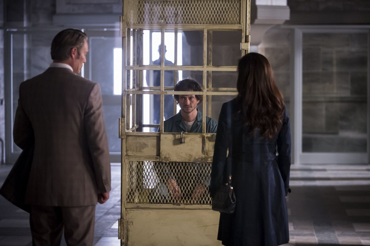
By watching through the first season and evaluating some of the shots such as the one above and realising how many elements of the gothic genre are actually present in this series.
An oppressive and gloomy setting is established very quickly with a recognisable setting of a prison or mental institute . a very isolated and obviously tormented character is posed centrally and caged off from the surrounding figures who either have their backs to the viewer or placed ominously in the background. Again, there is a very stylised and saturated colour palette of a range of greys, blues and browns. The lighting is strongly stylised. with a bright pool of light from the behind and the the left of the central figure casting long and ominous shadows across faces and the surrounding area.
the same gothic elements can be seen in the next two images taken from the show. Again, the figure we presume is the main character is caged/ boxed inside a central area with low lighting darkening his features , making him look threatening and more ominous than the figure seen in the first image who is placed in a open setting at the other side of the caged area. He is also set centrally with light framing a greater portion of his face giving him a less frightening but still unsettling presence.
Tim Burton is an obvious choice a well known Director who specialises in the Modern Gothic genre. weather its in a suburban or a secluded setting, Burtons films are quintessentially gothic in every sense of the word. Atmospheric settings, Dark characters and a very specific creepy style make his work very distinguishing as Gothic as he uses all the elements to create memorable scenes and characters.
Because of this , most of the production work for his films are also carry the gothic elements, I decided to look at a lesser known Burton Film which I feel conveys a very modern take on the Gothic genre.
"Dark Shadows" is a film adaption of a popular cult Television series of the same name from the 60's and Burton has done a very good job of transporting the audience back to his own warped version of america which spans from the early 1700's to the 1960's/ 70's.
Recently I wanted to explore this film again as I wanted to base one of my experiments on the style of the film mixed with another Horror Series .
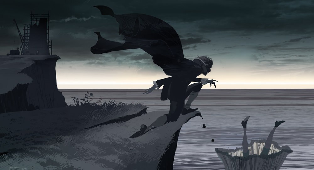
I looked at the production art that was present in the Visual Companion for the film and found them to be really atmospheric and very useful as a visual influence.
Although there were many different artists working on the concept / production for the film, you can definitely see how they all convey the stylised Gothic style that Burton uses in his Films.
This first image is very effective in conveying alot of emotion and urgency, the dramatic lighting and the way the figure is placed centrally and in danger generates a feeling of unease and worry .
The lighting in the image is stylised and dramatic , with pools of shadow and very crisp colours making to image very intense looking and a perfect example of an artist paying homage to the early gothic hammer film genre .
The second image is also very stylised, With a limited colour palette and plenty of shadow which gives a great sense of depth and drama to the image. With a stereotypical Gothic image of a derelict and lonely setting , a feeling of supernatural elements and characters in peril.
The fact that the artist has used a very saturated and limited palette for this image helps to enhance a sense of very the early Gothic Horror film elements present in the film and in the image itself .
Perhaps one of the best series to research for this project. American Horror story is a TV series which explores the various elements of horror and thriller in a stylised setting. Throughout the Three seasons aired, the audience has been transported into three equally unsettling settings which explore deep fears and complex themes within human nature and psyche by taking well known settings of a haunted house (" Murder House" - Season 1 ) , A mental institute ("Asylum" - Season 2 ) and a city steeped in dark and powerful history / witchcraft ( "coven " Season 3 ) .
All of these explore a way of conveying Horror and a The Gothic in a way that has not been experienced before, the series has a specific style of setting the storyline for each season in at least 3 different periods/ decades in often secluded or oppressive places , letting the audience see how the gothic elements can be transferred into each setting with ease, giving us an unsettling realisation that the mondane can be quite frightening when placed into the right context.
Here are some examples of the teaser trailers used to promote the show. they are all very effective in generating a very unsettling and creepy stigma for the show . It fuels our curiosity and shocks us into wanting to see more. The use of roughly cut editing along with stylised framing , colour and sound all combine to make the teasers frightening and a good example of modern gothic being used .
- Isolated and Bleak settings
- Characters who are threatened and often Isolated and Alone, either physically or emotionally.
- A sense of high emotional termoil
- Supernatural Elements with lots of references to Murder, Death and Violence
-A sense of Foreboding with very Ominous Implications.
By looking at what makes these examples of Modern Gothic work I can see very clearly that my characters and comic would fit very well in a more modern setting when placed with this highly stylised mechanisms.
I started my experiments exploring how I could costume some of the characters. since this experiment was to be the one with the most colour compared to previous experiments I wanted to explore some colour theory and some of the palettes used for American horror story as I had an idea of the colours that I wanted to use to be kind of drab and saturated .
I think out of all the characters I used, Nicholas seems to already fit the genre very well , with his isolated and eccentric mannerisms and a dark side that comes across well in the new clothing and style I created for him based on the fashion from some of the shows I researched .
Once I had an idea of what the characters would look like when placed in this new setting I started to generate some thumbnails for my response comic.
I found that I wanted to convey a lot of tension between the characters as that seems to be that modern gothic works focus a lot on the high emotion and character relationships as well as the setting.
For this, I wanted to include a more film like approach to this experiment with dramatic zooms and more interesting angles to make this experiment convey the tension and mystery a little better.
One of the most prominent elements that comes across regularly in Modern gothic is its very stylised colour palettes. they are often either very saturated or rich with a sense of well thought out colour theory. I decided to experiment with this by looking at a few examples of the colour palettes used in Hannibal and American Horror Story as these are both very stylised and work the most effectively .
this is an example of a colour palette from American Horror story Asylum which I used as a resource when conducting my own colour experiments.
By looking at some of the colour palettes and then using similar palettes for my own images I can determine how well this experiment will work when I begin to finalise the response for this period.
I started by blocking out the areas of colour , getting a sense of how the image will look once coloured and how effective it will be tonally .
After looking at the color I started to finalise a more final version of my response sketches which I think worked pretty well at conveying some of the elements of modern gothic works such as a strong focus on character dynamics and the psychological side along with a murkey and decaying setting with some mystery surrounding alot the characters who are we cannot see as clearly as we see them in my other experiments, helping to fuel that feeling of unease and mystery .